WelcomeDesk 2.0: A Premium Redesign, Dark Mode, and Feature Alignment Across Every Surface
There is a version of this post that is a feature list. We shipped a lot: dark mode, a new design system, a redesigned kiosk, branded emails, brute-force protection. But the feature list is not the point of 2.0. The point is that the product finally looks like what we have been building.
Why a 2.0?
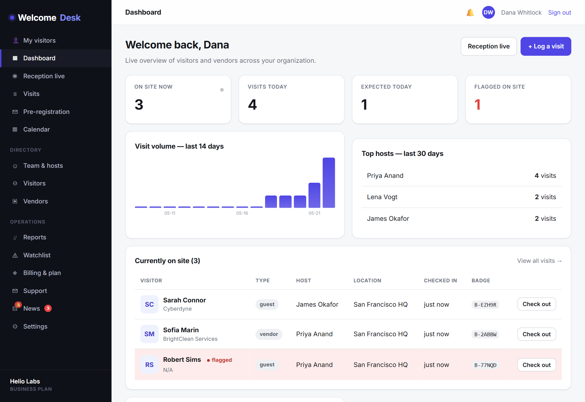
For the past eight months we shipped fast: multi-channel notifications, evacuation reports, calendar pre-registration, ID verification, SAML SSO, lobby modes, a host PWA, in-app support tickets. All of it ships, all of it works. But at some point I pulled up the dashboard on my phone while Connor was running a kiosk demo, and thought: these do not look like the same product. The kiosk was beautiful. The dashboard was fine. I really dislike "fine."
That was the day I stopped adding to the roadmap and started planning a design pass. Every surface (dashboard, kiosk, host app, admin portal, settings, billing, support) was rebuilt around a single design system, so the polish you feel on one page is the polish you feel on every page.
A premium design system, applied everywhere
2.0 introduces a unified token system (brand, surface, muted, ink, accent) that every component now draws from. The practical effect: typography, spacing, colour, shadow and motion are consistent across the entire product. Inter at 800 for headlines. Layered, soft shadows on cards instead of harsh borders. Smooth radii. A refined neutral palette that lets the indigo brand do the talking when it needs to.
It's not change for change's sake. Every component you already knew is still where you left it; it just looks like it belongs to a product that costs ten times the price.
Dark mode, and why it took a year
Dark mode has been on the roadmap since roughly the first week after launch. The reason it kept getting pushed: doing it correctly means designing two full versions of every surface, not tinting the existing one. The lazy version is a CSS filter: invert() on the root element and it looks exactly like that. We did not want the lazy version.
Motion that earns its keep
Animation in 2.0 is purposeful. Metric cards count up rather than snapping into place, so the eye lands on the latest number. Entrance reveals on hero sections, gentle hover lifts on cards and a tasteful spring on icons make the product feel responsive without ever feeling busy. Everything respects prefers-reduced-motion, so colleagues who'd rather sit still can.
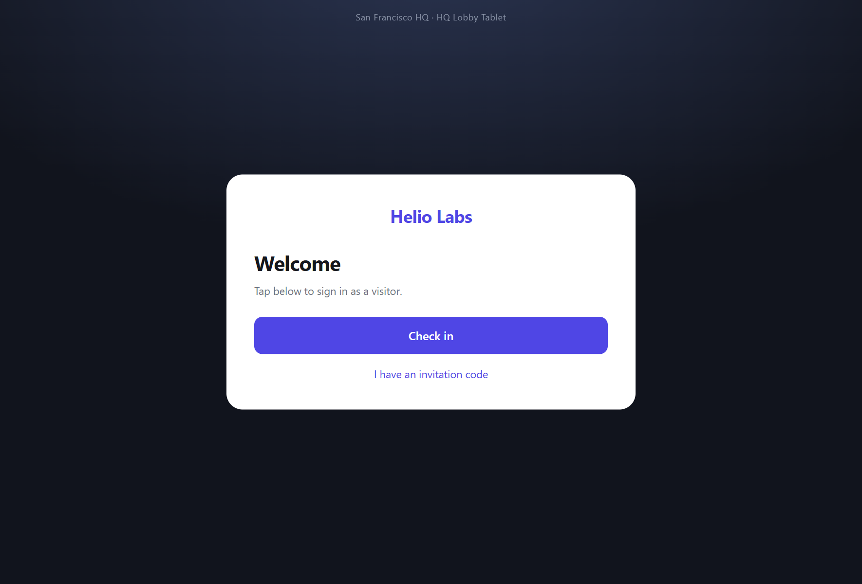
The kiosk, with a little delight
The kiosk is the part of the product your visitors actually see, which makes it the one where the design matters most. Floating ambient orbs in the background. Eyebrow labels that guide the eye through each step. And when a check-in completes, the done screen now celebrates: ninety pieces of brand-coloured confetti fall across the screen for a beat before it resets for the next guest.
We debated the confetti. It felt like a gimmick. Then we put the kiosk in front of someone during a demo and watched them smile at it, and that ended the debate.
Illustrated empty states
An empty page used to say "no data." It now shows what'll be there. Nine of the most-visited screens (directory, invites, announcements, lockouts, reports and more) have illustrated empty states that explain the screen's job and point you to the next useful action. New customers learn the product faster; existing ones get a tidier home when they're not in a busy week.
Feature alignment: what the design refresh sits on top of
The visual update would be hollow without a product to back it. 2.0 also bundles a wave of feature-alignment work: finishing touches that bring every previously-shipped capability up to the same standard.
- Transactional emails, redesigned. Every email WelcomeDesk sends (visitor arrival, host invite, password reset, watchlist alert, every admin notification) now flows through a single branded template aligned with the marketing site. Three tones (default, alert, admin), one consistent voice.
- Account-security baseline. Repeated failed sign-ins now trigger an automatic lockout with admin-managed unlocks. Outbound webhook URLs pass through a new SSRF guard so a malicious URL can't probe our own infrastructure.
- Nameplate display. The live kiosk gains a per-location toggle to display a host nameplate when a visitor is greeted. A small touch that makes the front desk feel more deliberate.
- People & lockouts management. A bulk-invite flow on the People screen, an improved filter and empty state, and a Lockouts screen under Settings that any admin can manage.
If you want the longer story on the security-and-trust changes, our companion post Trust, in the Details goes deeper.
The same promises, more visible
WelcomeDesk has always been built on two ideas: it should run in your browser without an iPad app, and it should cost one price for every office instead of one price per location. 2.0 doesn't change either. What it does is make the product look as serious as those promises sound, so the comparison-table moment on a review site stops being a price-only win and starts being a price-and-polish one.
What's coming next
2.0 isn't the end of the roadmap; it's the foundation for what comes after. Two-way kiosk messaging, deeper access-control integrations and offline kiosk mode are next, and each of them is much easier to land on top of a unified design system than they would have been six months ago.
The design is live on every workspace from today. Nothing to upgrade, nothing to opt into. Sign in, toggle dark mode if you have been waiting for it, watch the confetti when your next visitor checks in. And if something feels off, the Support link is one tap from anywhere in the product. Tell us. We are not done.
See WelcomeDesk at your front desk
Browser-based visitor management, one price for every office. Free for 14 days.
Start your free trial